


better days, toronto
Better Days - Coffee & Donuts, drawing inspiration from mid century California and the ambiance of classic diners.
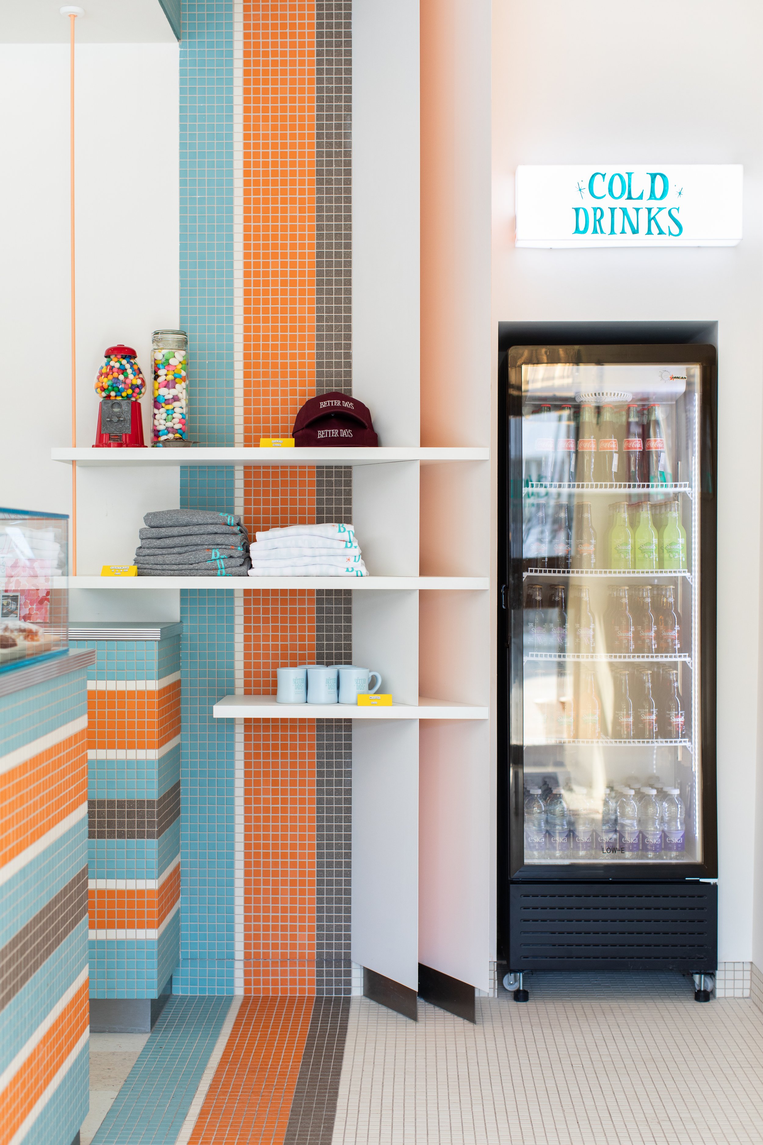
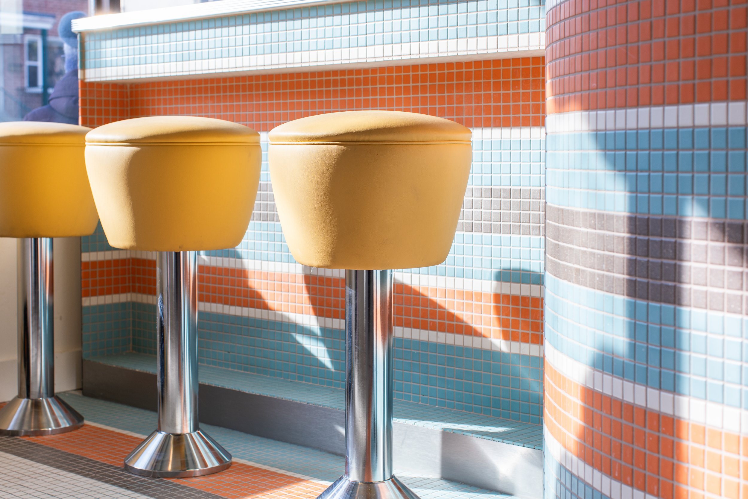
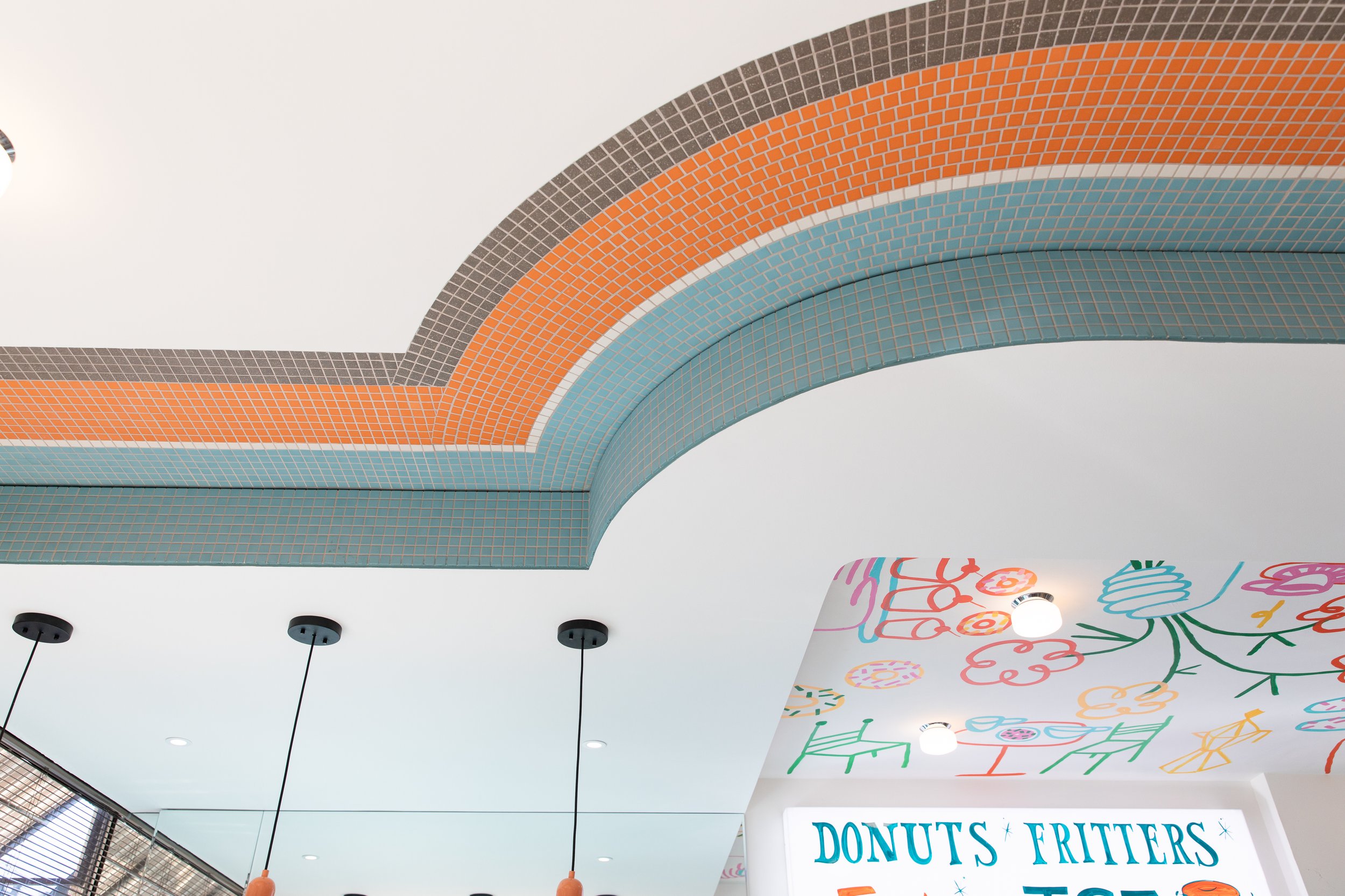
This establishment is a tribute to days gone by, where patrons can savor the timeless combination of classic donuts and drip coffee. The interior design aims to transport guests back in time, featuring a vibrant color palette of chocolate brown, turquoise, and vivid orange. Vintage aesthetics, including securely fastened stools and retro-style pendant lighting, will infuse the space with a nostalgic charm.
To enhance the retro theme and evoke a sense of history, we will employ materials such as Formica, stainless steel, and straightforward square mosaic tiles. Better Days will warmly welcome families and children, offering a welcoming neighborhood atmosphere reminiscent of simpler times. A bespoke neon sign adorning the front will serve as a beacon, embodying the vibrant colors and nostalgic references found within."
This version maintains a professional tone while conveying the concept and details of Better Days - Coffee & Donuts more eloquently.
Photography by Britney Townsend
Styling by Studio Otty